HERO CATALOGUE
A well-crafted special offer promotion helps:
- Spark immediate interest
- Create urgency
- Drive conversions
- Strengthen emotional connection to the brand
Combining powerful visuals and clear, emotional messaging ensures the offer stands out and moves people to act.
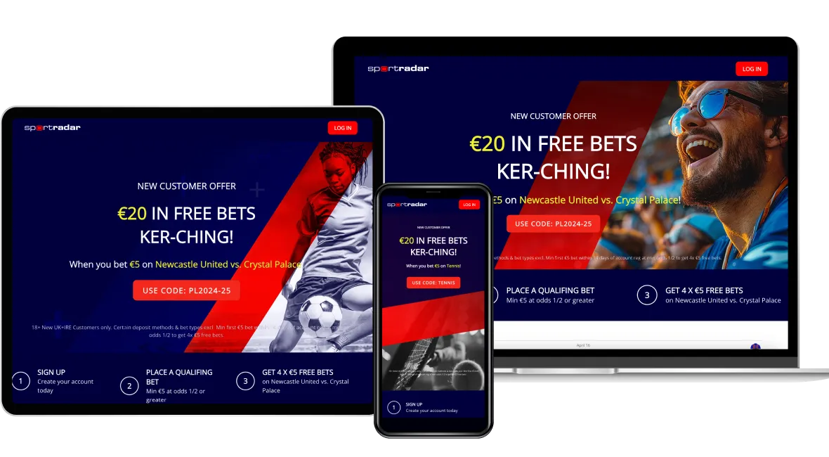
But just as important as the content itself is how it's presented across different devices. With users constantly switching between desktops, tablets, and mobile phones, responsive design ensures that your promotion looks great and performs flawlessly — wherever it's seen.
But just as important as the content itself is how it's presented across different devices. With users constantly switching between desktops, tablets, and mobile phones, responsive design ensures that your promotion looks great and performs flawlessly — wherever it's seen.
 Layout 1
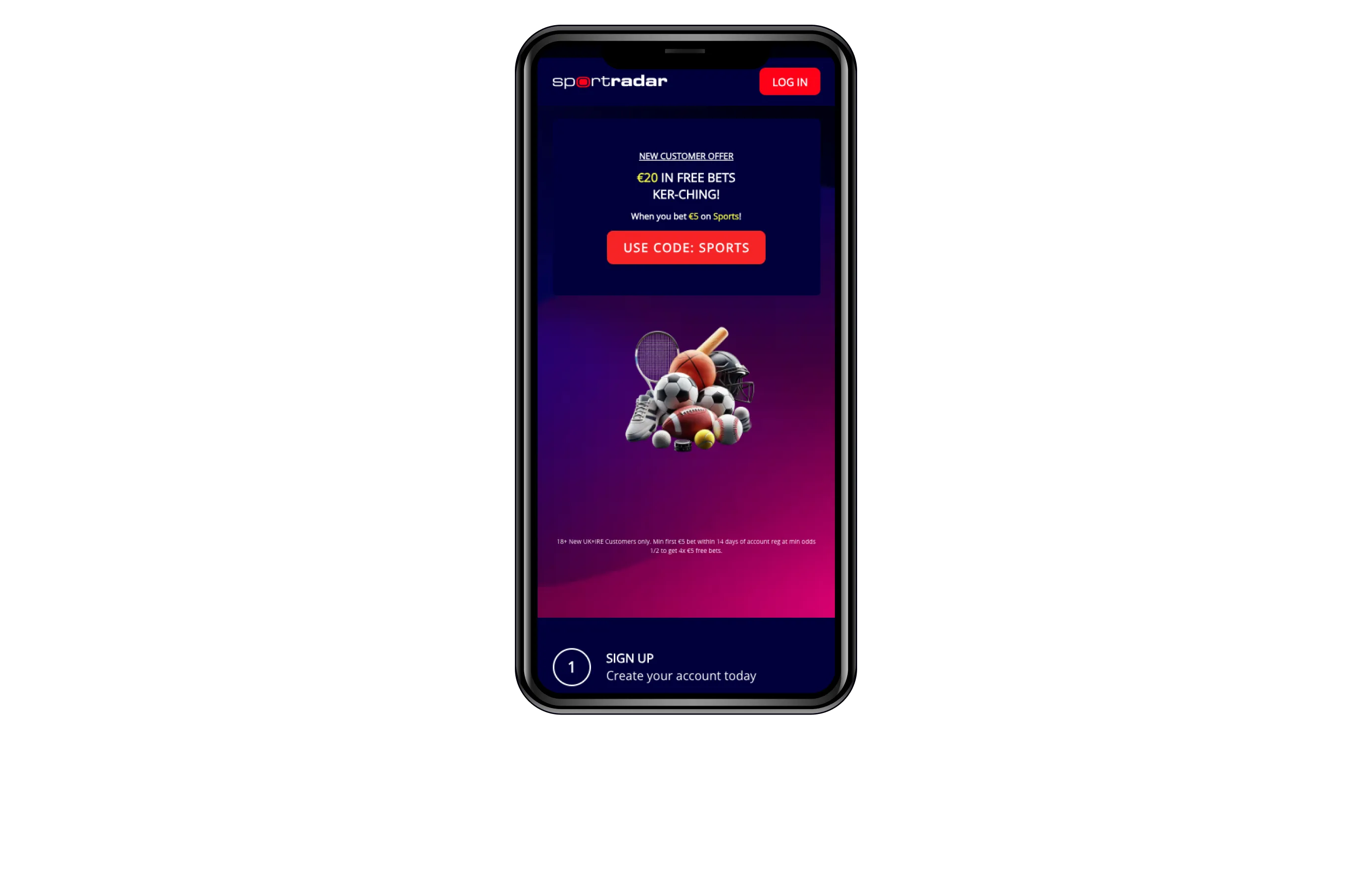 Layout 2
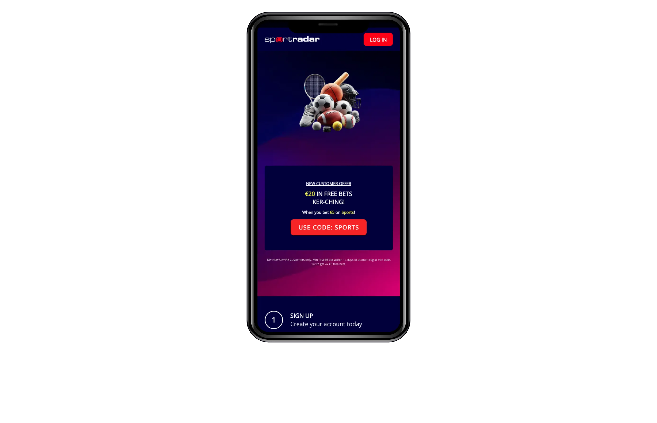 Layout 3
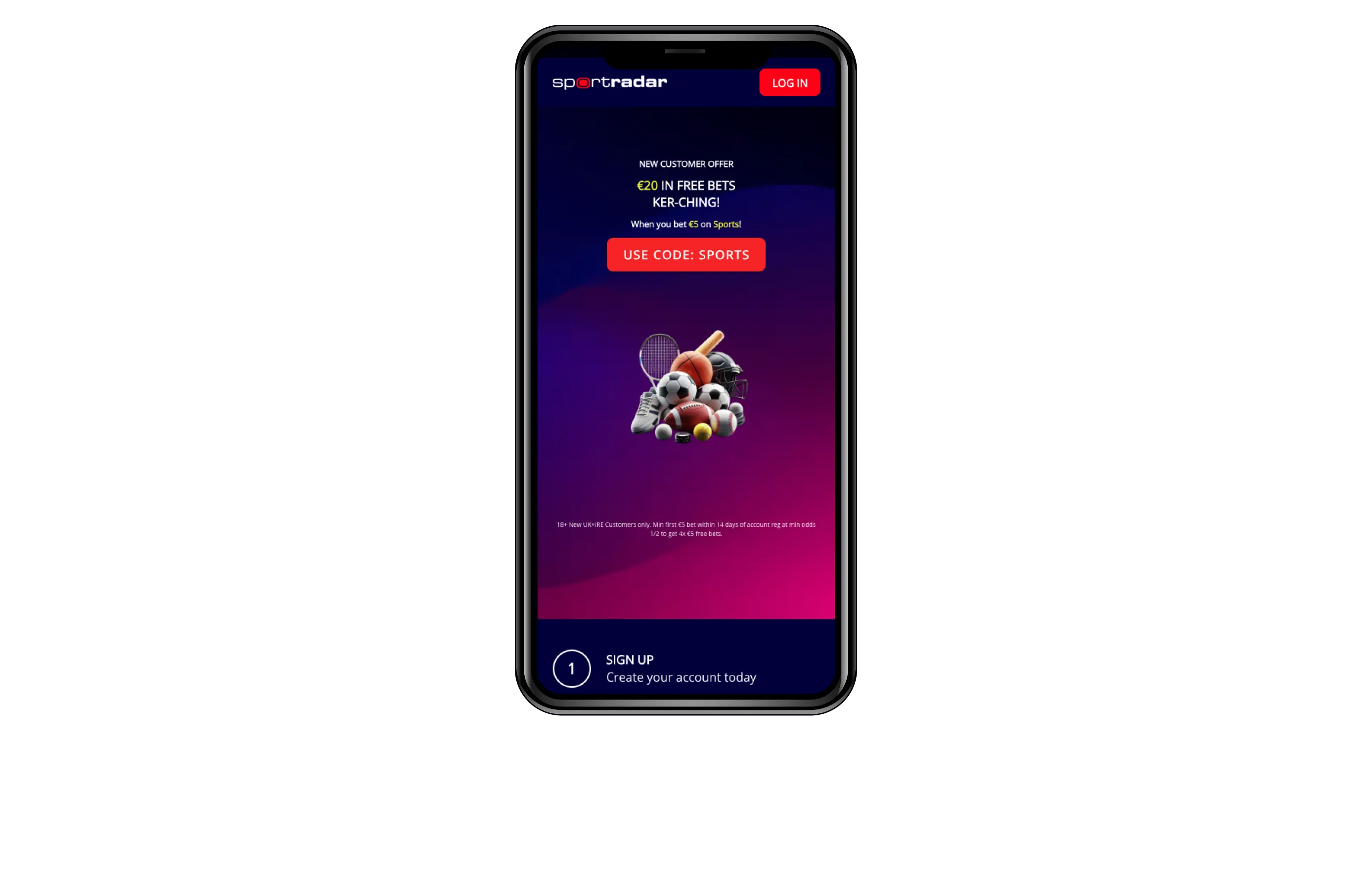 Layout 4
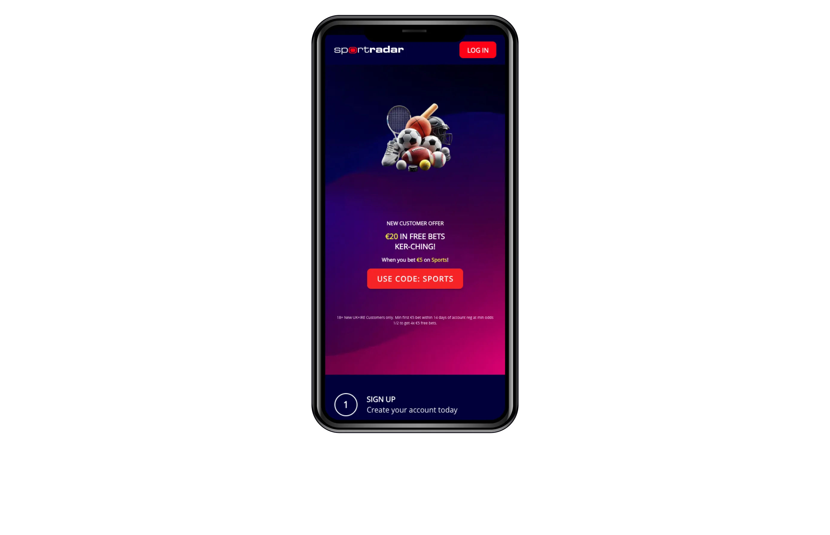 Layout 5
Item 1 of 5
 Layout 1
 Layout 2
 Layout 3
 Layout 4
 Layout 5
Item 1 of 5
 Layout 1
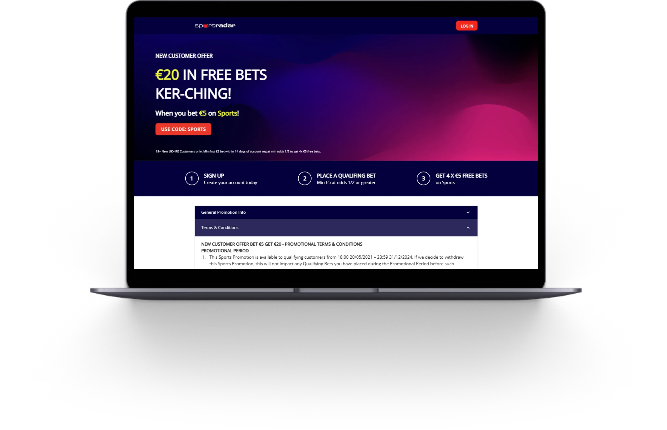 Layout 2
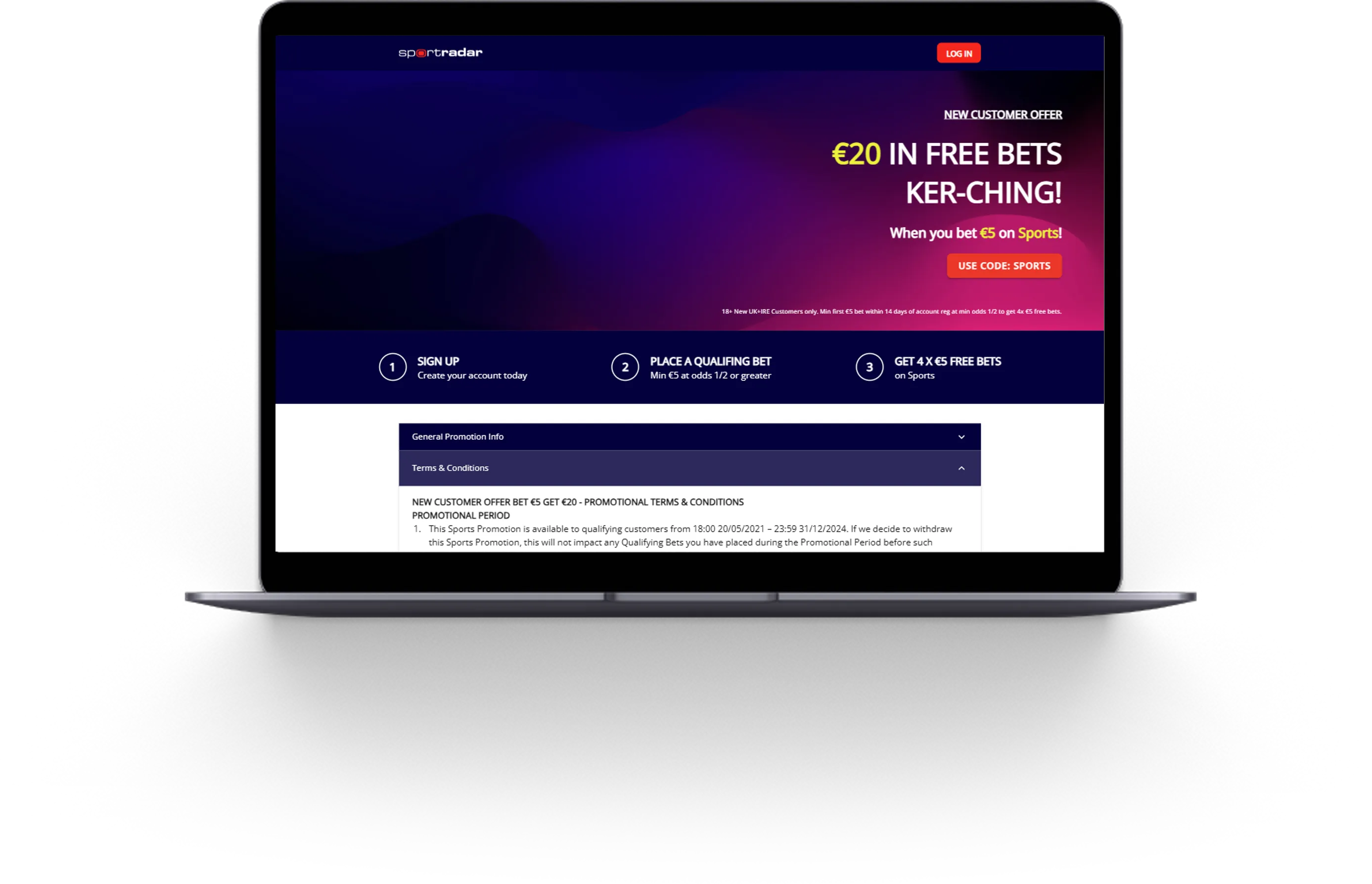 Layout 3
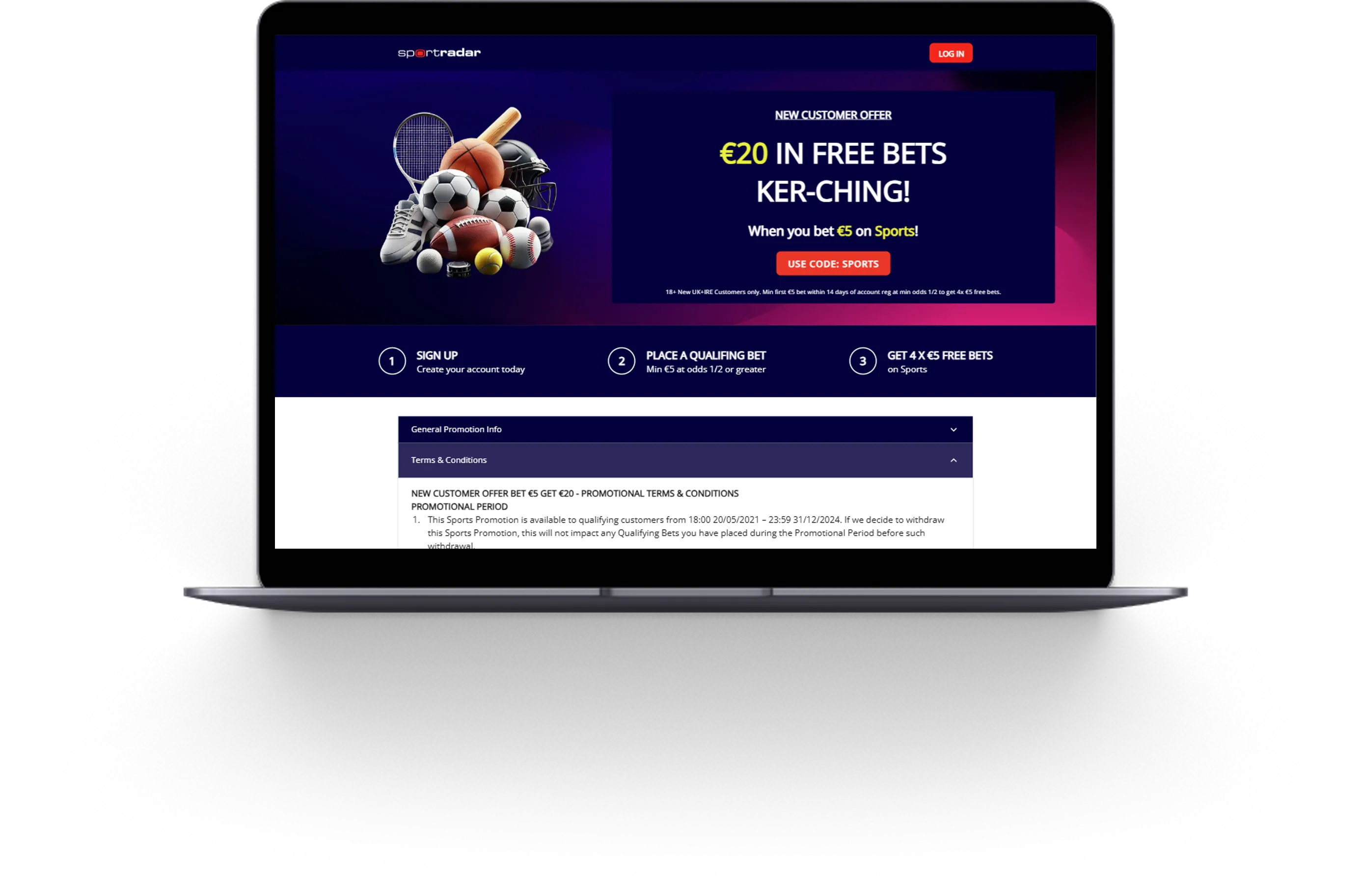 Layout 4
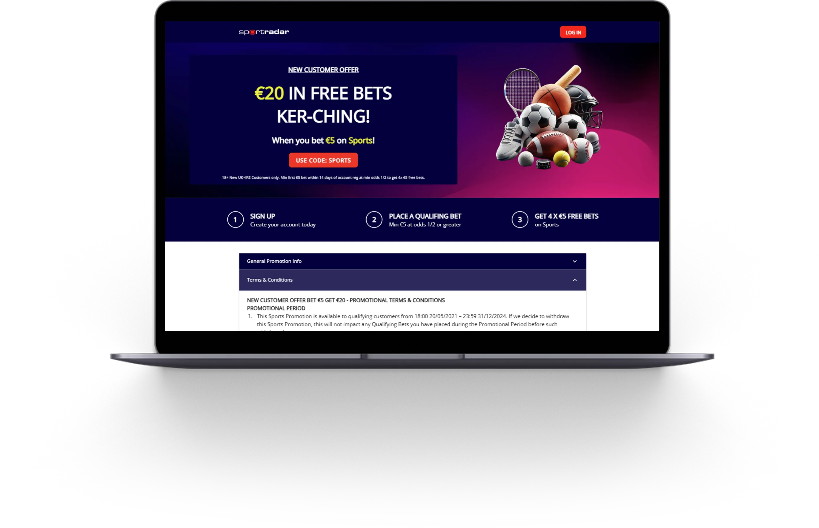 Layout 5
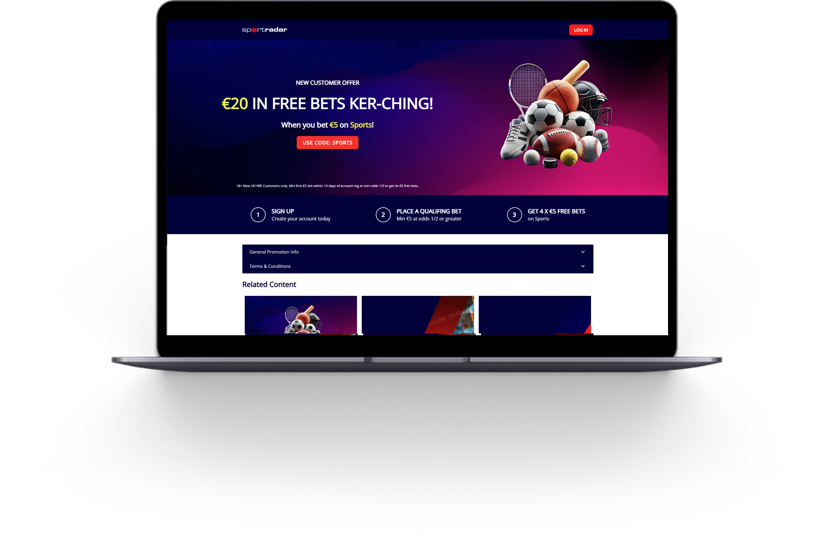 Layout 6
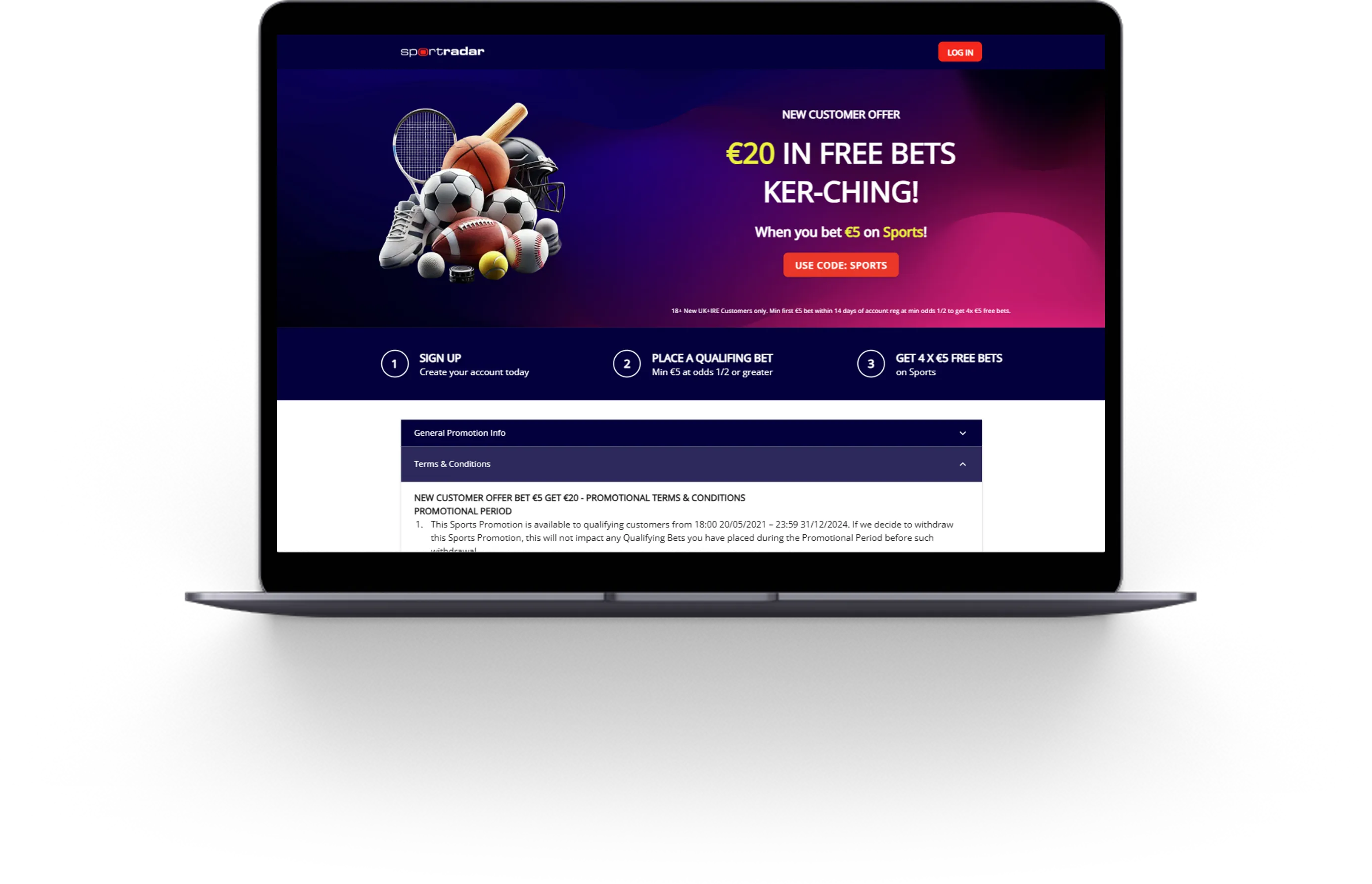 Layout 7
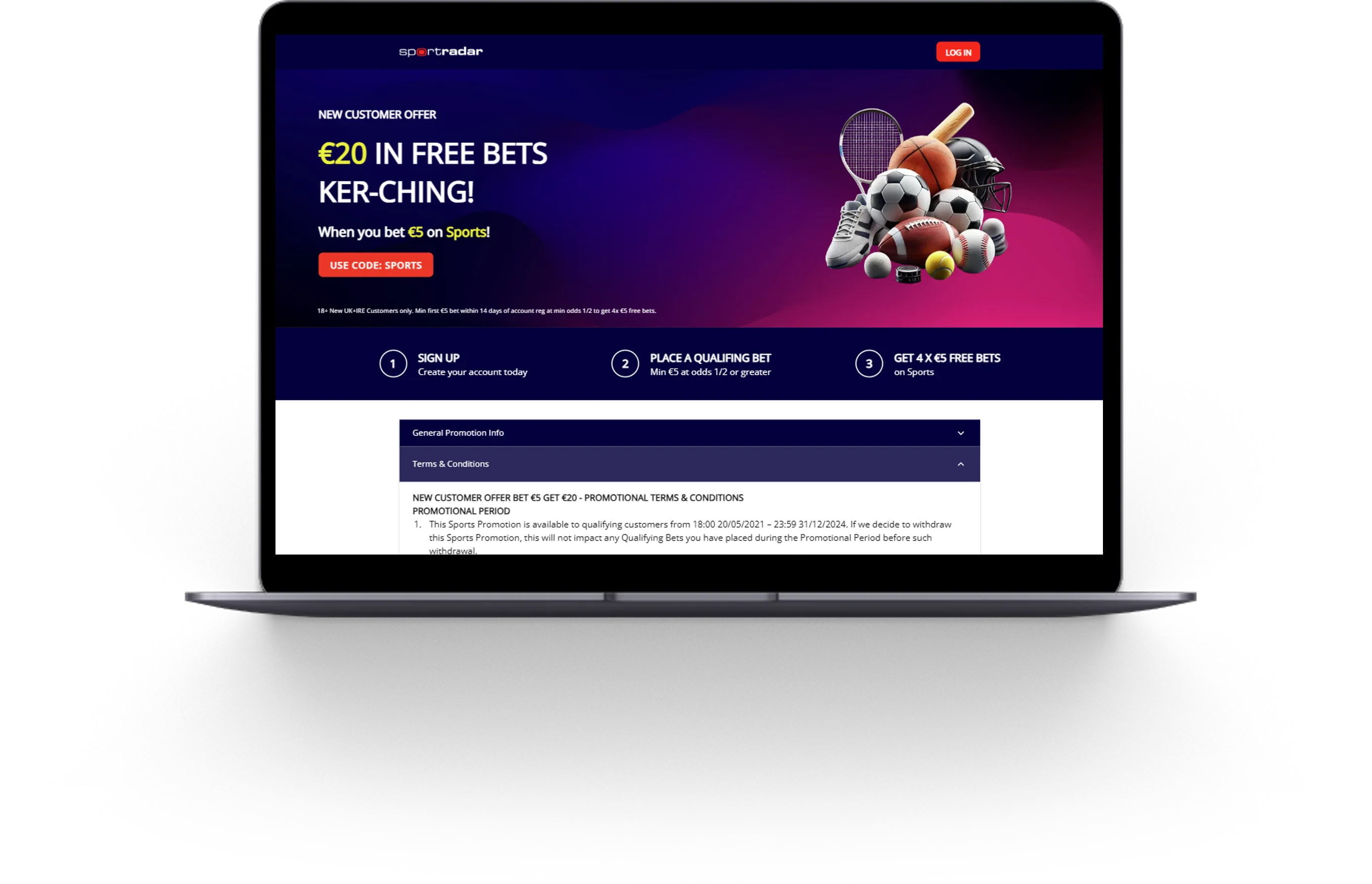 Layout 8
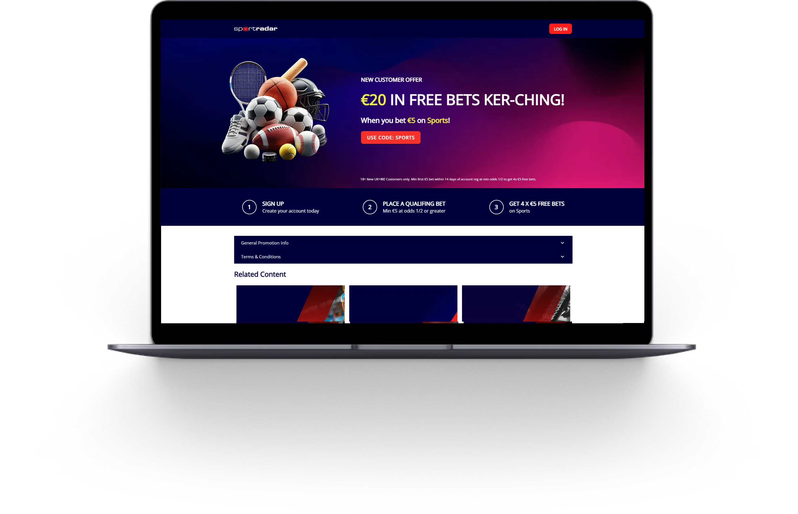 Layout 9
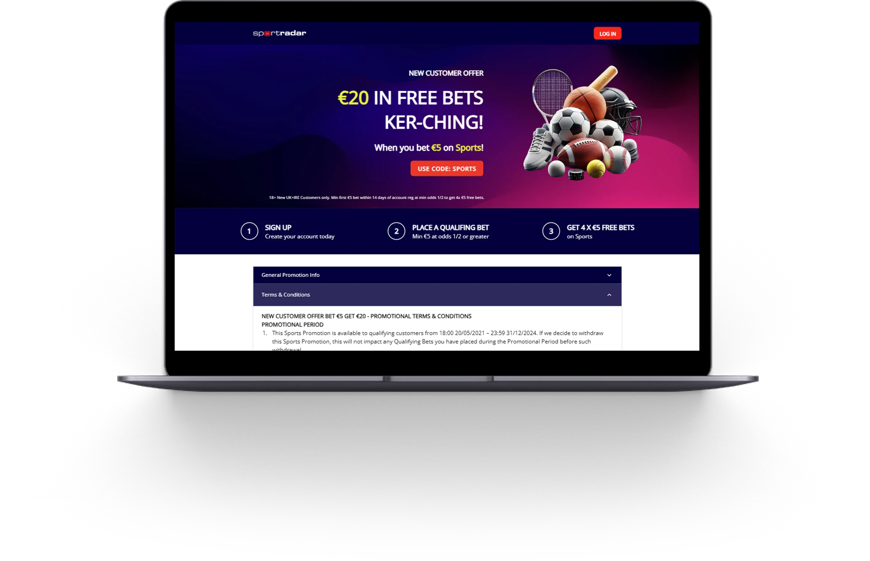 Layout 10
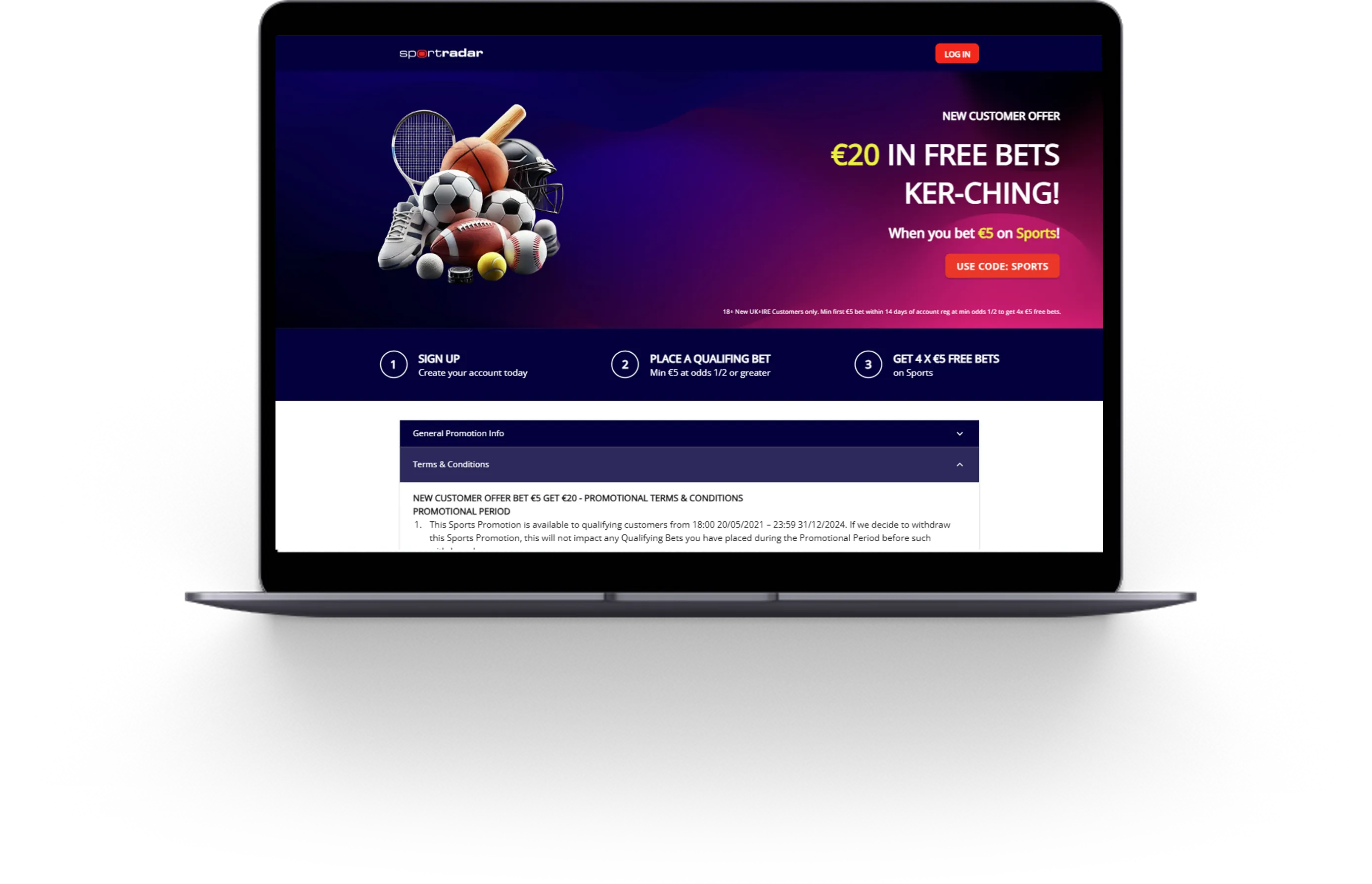 Layout 11
Item 1 of 11
 Layout 1
 Layout 2
 Layout 3
 Layout 4
 Layout 5
 Layout 6
 Layout 7
 Layout 8
 Layout 9
 Layout 10
 Layout 11
Item 1 of 11
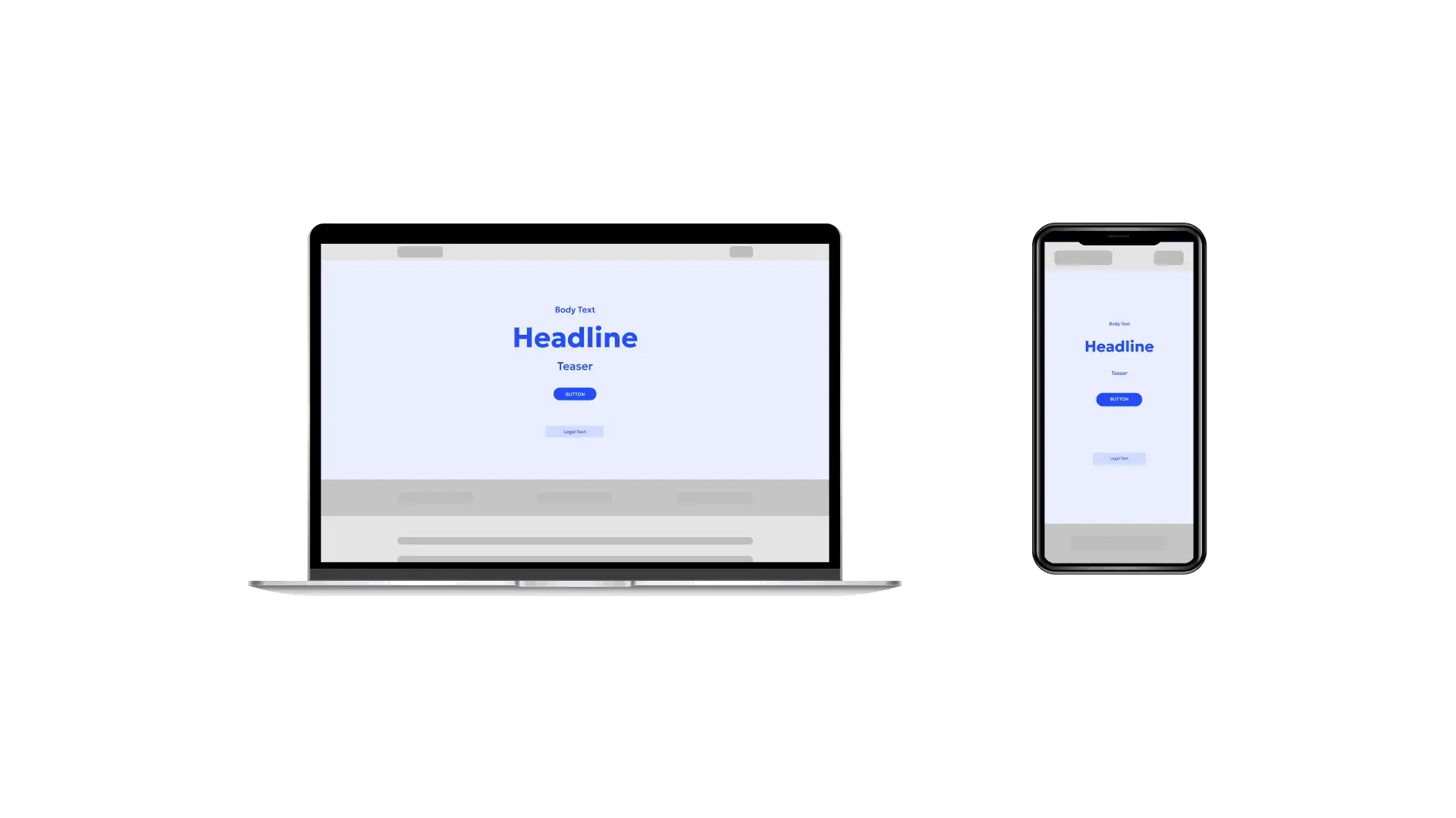
How desktop and mobile layouts can be combined
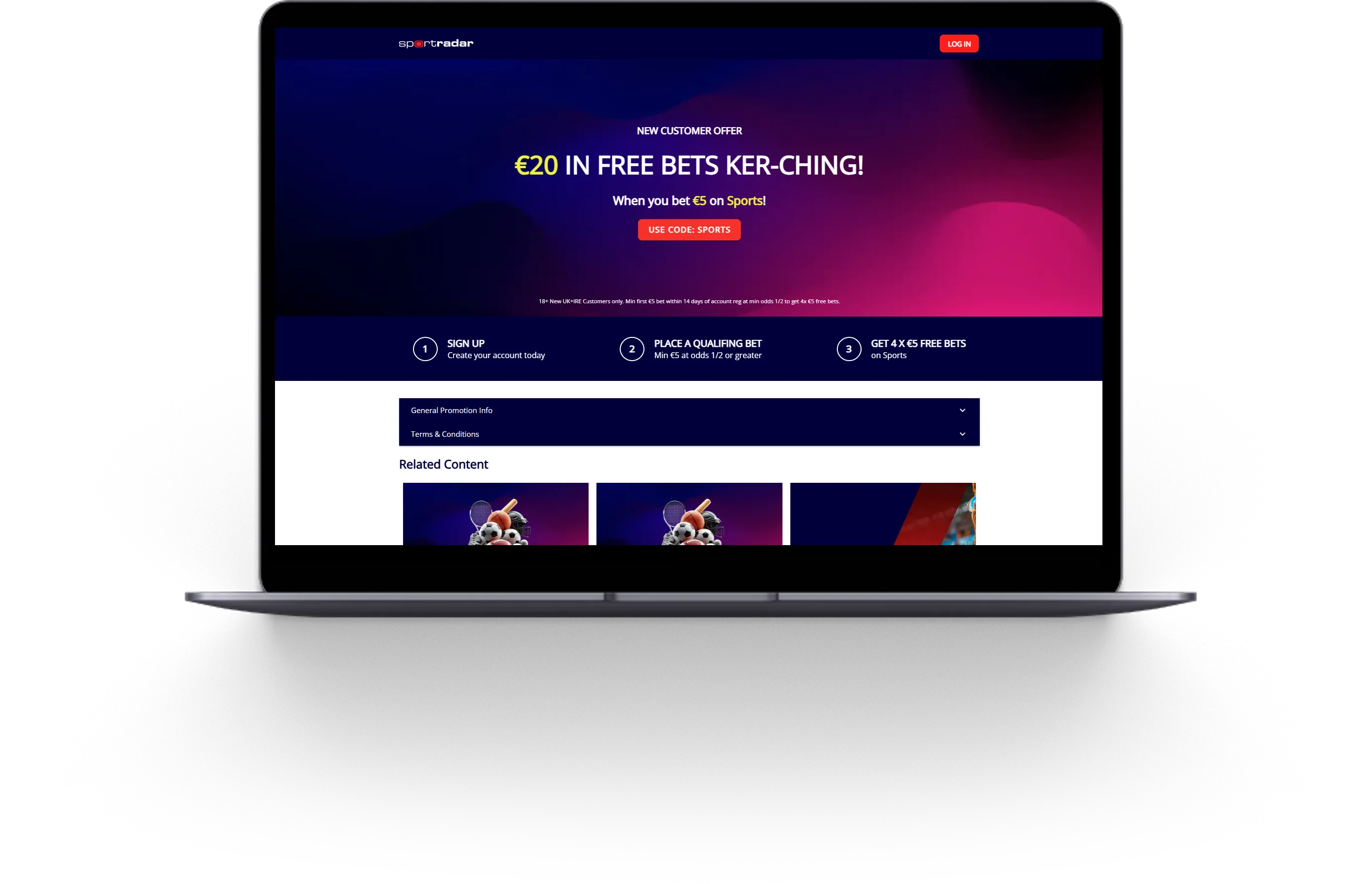
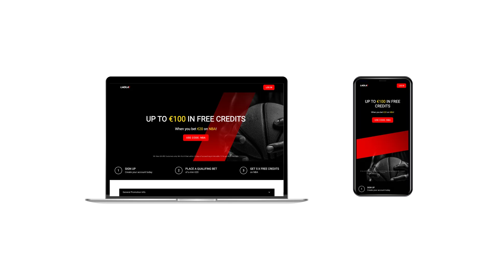
This pairing puts the focus on full-screen background imagery and bold promotional messaging. With no overlay images, the design is clean and emotionally led — great for storytelling or showcasing powerful visuals. Use different imagery for desktop and mobile to optimize impact across screens.
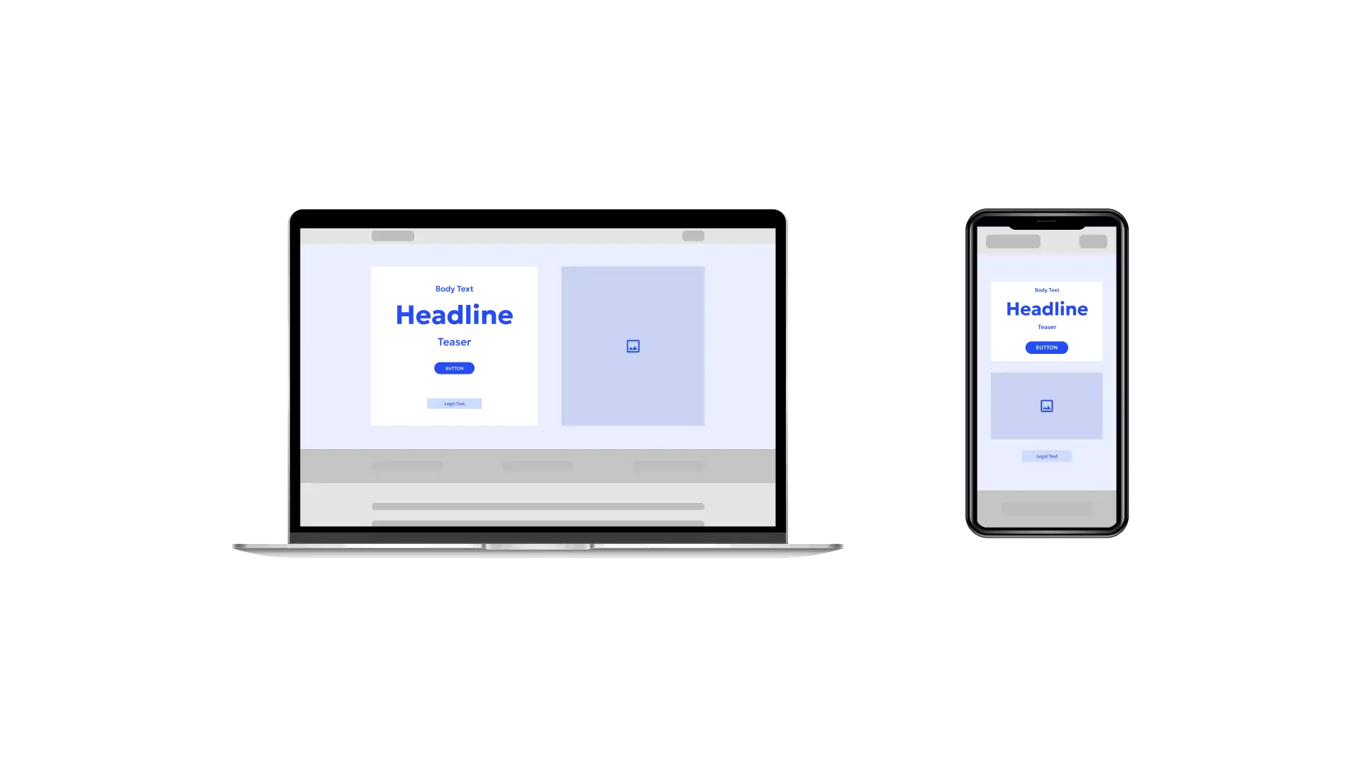
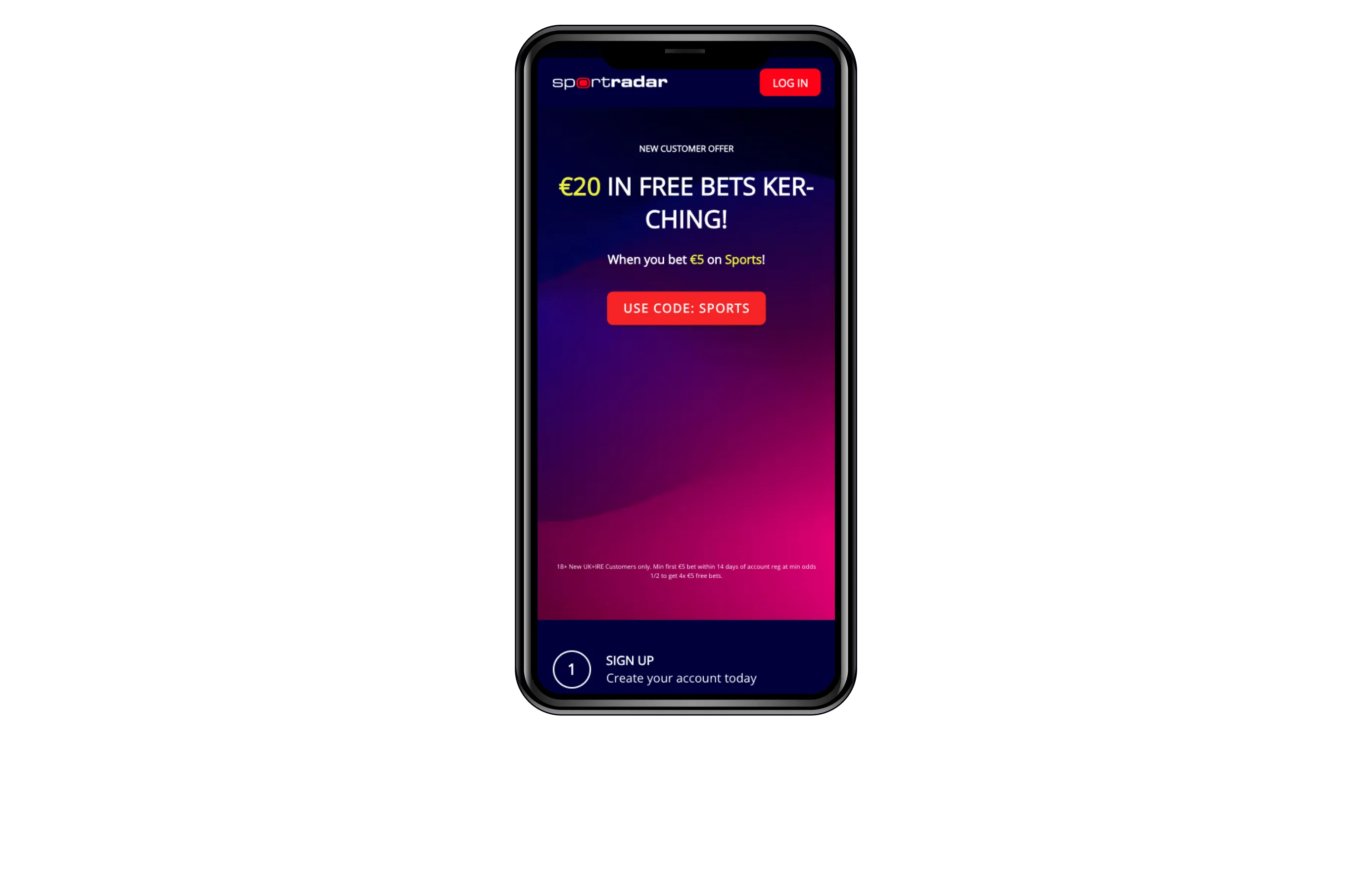
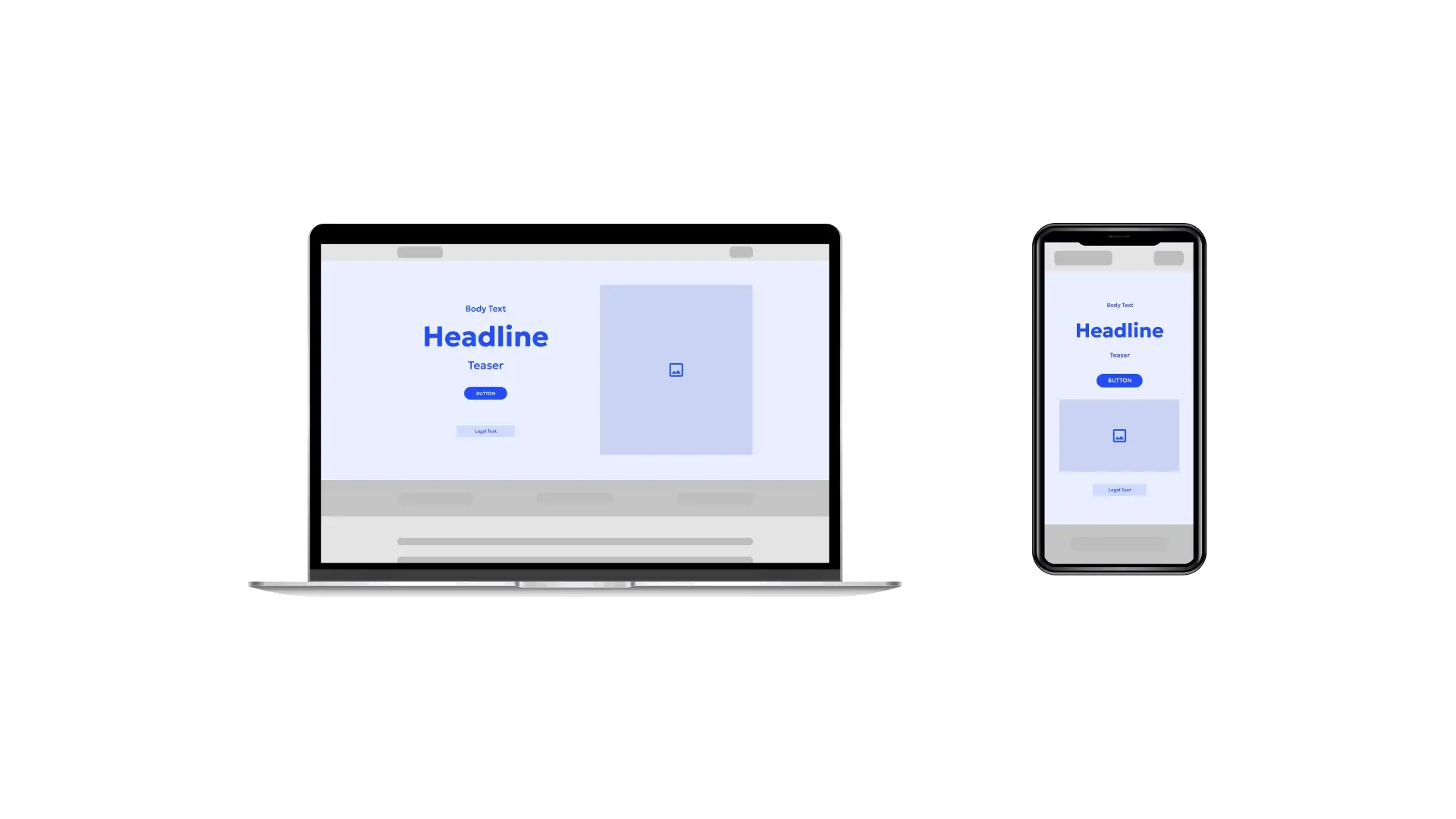
This setup combines an eye-catching overlay image with a background color block that anchors the text. On desktop, you control whether the image sits left or right. On mobile, it adapts to top or bottom. It’s a versatile layout built for clear messaging and bold visual framing — on any screen.
Without a color block behind the text, this layout opens up text alignment options on desktop — left, center, or right — so you can match your brand’s tone and hierarchy. Paired with an overlay image, it gives you layout control and visual punch, with full adaptability between desktop and mobile.